 |
| source |
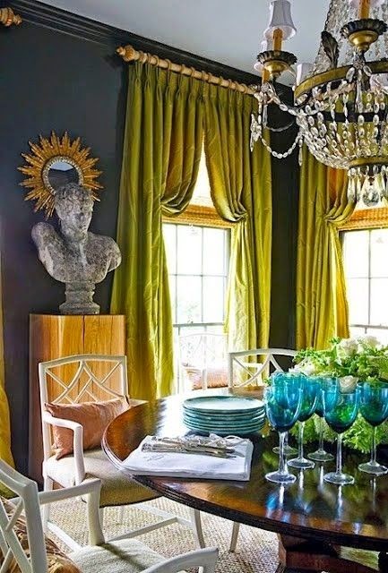
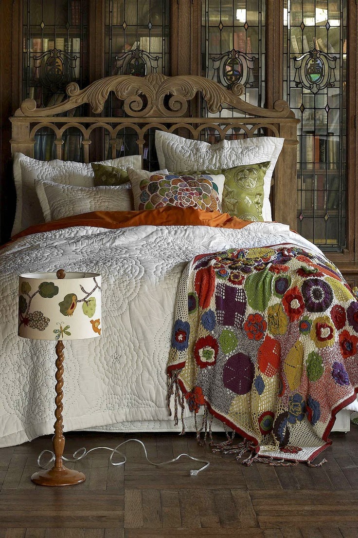
Sometimes as I'm scrolling through Instagram or Pinterest, I feel like my feed is flooded by rooms and decor that all look the same. The trending spaces look something like this: White on white on white. Accents of gold. Splashes of hot pink. And maybe (if things get crazy) some black and white stripes.
I read somewhere that an Instagram photo with a lot of white is likely to get more hearts. That as users scroll through their feed, the white background will be a visual break for the eyes and they'll feel more inclined to double-tap that.
Don't get me wrong. I do love the look of a fresh, clean white space with pink peonies and gold picture frames. And I do double-tap those lovely spaces - even though I could never imagine myself living surrounded by SO. MUCH. WHITE. And to each their own. (I fully believe in decorating with your own style and likes.) ...I'm just feeling whited out lately.
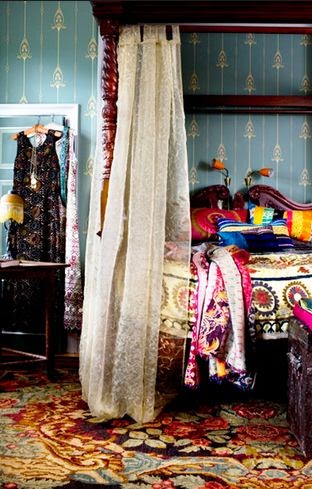
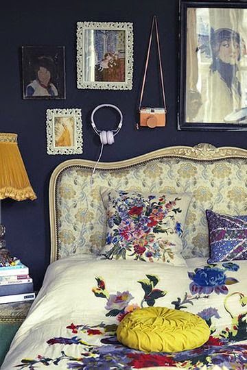
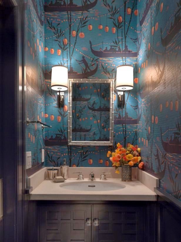
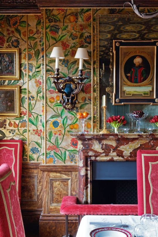
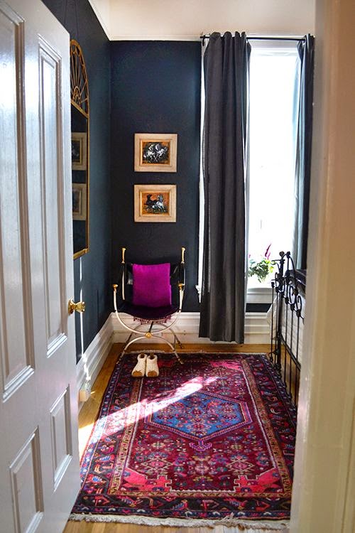
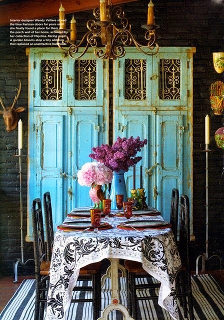
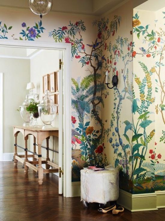
I need to see some darker colors, heavier textures, and richer textures.
So here's a little round-up of what really gives my eyes a visual break from all that trendy white on white on white. I hope you enjoy these luxurious, rich-hued, patterned-filled rooms as much as I do. :)
 |
| source |
 |
| source |
 |
| source |
 |
| source |
 |
| source |
Which is your favorite?

Comments